Can QR Codes Be Colored? QR Code Color & Background Guide
Yes — a QR code doesn't have to be black and white. The foreground modules, the background, or both can use other colors and the code will still encode the exact same data, provided the underlying module pattern stays intact. The real question isn't whether color is allowed; it's whether a given color combination still gives a scanner enough contrast to tell the modules apart from whatever is behind them. Some color choices look perfectly fine to a person and still fail to scan — that gap is what this guide covers.
Can QR Codes Be Colored?
A QR code is a grid of small square modules, each either "dark" or "light" in the pattern's logic. Nothing in the format requires those two states to be black and white — a generator can paint the modules in a brand color, tint the background, or both, and the decoded data doesn't change.
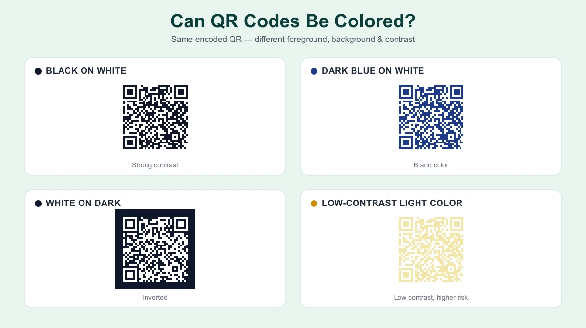
That's genuinely useful for branding: a dark teal or navy foreground on white still reads as clearly as pure black in most cases, and a colored code can match a logo or print piece far better than a plain black square. The caveat is reliability, not legality — nothing stops you from choosing any two colors, but not every pairing gives a scanner the same margin for error that black on white does. Coloring a QR code is a styling decision layered on top of the pattern; it doesn't change what the pattern needs to stay readable.
What Color Should a QR Code Be?
There's no QR code color requirement written into the standard — DENSO WAVE, the company that invented the QR code, says it plainly in its own FAQ: "Basically, please print out your QR codes with black on a white background." That's a recommendation from testing across scanners and lighting, not a rule the pattern itself enforces.
Dark modules on a light background stays the safest convention because it gives the widest, most predictable contrast across cameras and lighting. Within that convention:
- Black on white — the most tested combination across devices.
- Dark blue or dark green on white — common brand substitutions that keep similar contrast, as long as the color is genuinely dark, not a bright or medium shade.
- Other dark, saturated brand colors on a light background — generally workable; darker and more saturated holds up better than lighter or muted.
Light or pastel foregrounds, mid-tone colors close in brightness to their background, and metallic or glossy finishes that reflect unevenly under camera light are the choices that hold up less reliably.
What Background Color Should a QR Code Have?
A light, plain, uniform background is the safest starting point — it gives every module the same consistent surface to contrast against, wherever it sits in the grid. Problems tend to come from a short list of choices:
- Busy photographic or patterned backgrounds reduce the clean separation a scanner needs.
- Low-contrast backgrounds — a light gray or pale color close in brightness to the foreground — narrow the margin for error.
- Background color bleeding into the quiet zone (the blank margin around the code) can interfere with detection even when the modules themselves have good contrast.
The quiet zone needs to stay clean and unbroken regardless of color choices — more on that below. For how background choices interact with paper, lamination, and print quality, see our QR code printing guide.
Can a QR Code Be Any Color?
Not reliably — "any color" oversimplifies a real technical nuance. Contrast isn't only about how different two colors look to a person; it's about how different they appear in whatever a scanner actually measures. DENSO WAVE's FAQ gives a concrete example: "It is impossible to read a QR Code with the combination of white background and a red QR Code, or with a green background and blue QR Code." The reason is specific — dedicated QR scanners have historically used red light to capture the image, so if the foreground and background both reflect (or absorb) red light similarly, the scanner can't tell them apart even though a person sees clear contrast.
Modern smartphone cameras capture full-color images rather than a single red channel, so this exact failure mode is less predictable on a phone than on older dedicated scanners. But the underlying lesson holds: two colors that look high-contrast to your eyes can still be nearly indistinguishable in whatever the decoder measures — which is why DENSO WAVE's own FAQ concludes that "detailed experimentation is necessary before actually using colored QR codes." The riskiest combinations tend to share a few traits: a pale foreground on a light background, two colors with similar brightness despite different hues, the red/green pairings noted above, and reflective or metallic finishes that create glare.
Can QR Codes Be White?
A white QR code is really an inverted design — light modules against a background dark enough to stand in for what black-on-white normally does. It can work if the background is dark and clean enough for real contrast, and the scanning software handles inverted patterns correctly.
That second condition is worth being careful about. Compatibility with inverted, light-on-dark codes has improved significantly on modern smartphones, since most current scanning software locates the finder patterns regardless of which color is dark. But it isn't universal — some older phone cameras and scanner apps assume the conventional dark-on-light arrangement and can struggle with the reverse. Verify the actual design on more than one device before treating it as a given.
Can QR Codes Be Inverted?
Inversion just means swapping which side of the contrast is dark — light modules on a dark background instead of the reverse. The pattern itself doesn't care which way round it's rendered; a scanner looks for the contrast and geometry of the finder patterns, not a specific polarity.
Where inversion adds real risk is device coverage, not correctness. Dark-on-light remains the more broadly tested arrangement across the full range of cameras and apps in circulation. An inverted design can work well — plenty of dark-background packaging uses it successfully — but "it worked on my phone" isn't the same as "it'll work on whatever an unfamiliar visitor is carrying." Test it on more than one device before relying on it.
Does QR Code Contrast Matter?
Contrast matters more than any specific color choice, because contrast is the mechanism a scanner actually relies on — the ability to reliably tell a dark module from a light one across the whole grid. There's no single official contrast ratio defined for QR codes the way there is for text accessibility; a WCAG-style ratio doesn't directly apply here, and no QR standard publishes an equivalent number. The practical requirement is the same in spirit, though: a wide, consistent difference between the two states across the entire symbol.
Contrast failures tend to come from a small set of causes — similar brightness, hues that read similarly to the light source a scanner relies on (as with the red/green example above), glare on a glossy surface, and busy backgrounds. These are the same issues whether the code is colored, printed, or on-screen. Our guide on why a QR code turns out blurry or won't scan covers the fuller troubleshooting list.
Can QR Codes Use Gradients?
A gradient across a QR code's modules or background is a styling choice, not a supported format feature, and it adds risk a flat color doesn't. The concern is that contrast can shift across the symbol instead of staying consistent — a module near the light end of the gradient might contrast fine while one near the dark end doesn't, and a scanner has to correctly classify every module, not just most of them.
A gradient that stays within a narrow, consistently high-contrast range has a better chance than one that swings from very light to very dark, but there's no way to guarantee it without testing the specific file. ProURLMonitor's QR Code Generator works with a single flat foreground and background color rather than gradients — one reason it's a safer default for predictable results.
Can a QR Code Have a Transparent Background?
Transparency itself isn't automatically a problem — what matters is whatever ends up behind the code once it's placed. A transparent QR code exported as a PNG has no fill in the "light" areas, so whatever sits underneath it in the final layout effectively becomes the background for scanning purposes.
That's fine over a plain, light, consistent surface — it behaves the same as an explicit white background. It becomes a real risk over a photograph, a pattern, or a dark image, any of which can destroy the contrast the modules need even though the file itself was generated correctly. The quiet zone around a transparent code inherits whatever's behind it too, so a busy background can compromise that margin even if the modules look fine individually. ProURLMonitor's QR Code Generator currently exports with a solid background color you choose, rather than a transparent one.
The Quiet Zone and Finder Patterns Still Apply to Color
Two structural elements matter regardless of color, and styling a QR code doesn't loosen either requirement. The quiet zone is the blank margin around the modules — DENSO WAVE specifies at least four modules wide on every side, part of the ISO/IEC 18004 standard. A scanner uses that clear space to isolate the code, and a background color, gradient, or image bleeding into it can hurt detection the same way it would around a plain black-and-white code. See our QR code printing guide for the full sizing math.
The finder patterns — the three large squares in three corners — are what a scanner uses to locate the code and its orientation before reading any data. They need to stay clearly visible and high-contrast against their surroundings; heavily stylizing or partially obscuring them is a common way a "creative" QR design quietly stops working. Color is fine here as long as the finder patterns keep the same strong contrast the rest of the design relies on.
How to Use Brand Colors Without Breaking a QR Code
Brand colors and reliable scanning aren't in conflict — they just need to be combined deliberately:
- Choose a dark, saturated version of the brand color for the foreground rather than a light or muted tint — brightness matters more than the specific hue.
- Keep the background light, plain, and uncluttered.
- Preserve the full quiet zone — logos and decorative borders belong outside that margin, not inside it.
- Avoid pairing two brand colors with similar brightness, even if they look visually distinct as a palette.
- Test the final combination on-screen and in print separately — ink, paper stock, and lamination can each shift how a color actually reads.
QR Code Color Examples
| Design | Likely reliability | Why |
|---|---|---|
| Black on white | High | The most tested combination across scanners, cameras, and lighting |
| Dark blue on white | Usually strong | Similar brightness contrast to black; a common, well-tested brand substitution |
| Dark green on light background | Usually strong | Works the same way, as long as the green is genuinely dark |
| Light gray on white | Risky | Brightness contrast is too narrow for reliable detection |
| Yellow on white | Risky | Low brightness contrast even when the hues look distinct to the eye |
| White on black (inverted) | Potentially works, but test carefully | Correct in principle; device/app support for inversion isn't universal |
| Gradient on white | Depends on contrast across modules | Only as reliable as its weakest point along the gradient |
| QR over a photograph | Risky unless isolated with a clean background and quiet zone | Photographic detail competes with the modules for contrast |
None of these are guarantees — they're a starting point for where to expect trouble, not a substitute for testing the specific file you end up using.
Does Color Affect the Data a QR Code Encodes?
No — not directly. The data lives entirely in the module pattern: which cells are "dark" and which are "light," arranged by the QR standard's rules for structure and error correction. Recoloring the code — black to navy, white to cream, or anything else — doesn't touch that pattern as long as the module geometry stays untouched.
What color does affect is the step after that: a scanner still has to correctly classify every module as dark or light before it can decode anything. That's where contrast and background choices actually matter. A styling change that reduces contrast doesn't corrupt the data — the correct pattern is still there — but it can stop a scanner from ever successfully reading it. Color problems are a scanning failure, not a data-corruption one.
How to Test a Colored QR Code
Testing catches what color theory alone can't guarantee, since real cameras, lighting, and surfaces all introduce variables a screen preview doesn't show:
- Generate and export the final design at the size and format you intend to use.
- Test the digital file first, then against the real final background — not a placeholder, especially with transparency.
- Test at the intended size, since contrast issues invisible in a large preview can surface once a code shrinks down.
- Test on more than one device where practical — camera quality and decoding software both vary.
- Test an actual print proof if the design is headed for print, since paper, ink, and lamination can shift how a color reads.
ProURLMonitor's QR Code Scanner can decode a QR code from either your camera or an uploaded photo, which makes it a quick way to confirm a colored design actually scans before committing to it at scale.
Create a Colored QR Code
ProURLMonitor's QR Code Generator lets you set a custom foreground and background color for a QR code encoding a URL, plain text, Wi-Fi network, or vCard, and export it as PNG, SVG, or PDF. It works with a single solid color on each side — not gradients or a transparent background — and automatically raises the error-correction level if you add a logo.
If a colored design doesn't come out reading correctly, our guide on why a QR code is blurry or won't scan covers the fuller troubleshooting list beyond color and contrast.
Frequently Asked Questions
Can QR codes be colored?
Yes. A QR code's dark modules and light background can use colors other than black and white, and the pattern will still encode the same data. What matters for scanning isn't the specific colors — it's whether a scanner can clearly tell the modules apart from the background. Dark on light remains the safest, most tested arrangement, but it isn't the only one that works.
What is the best background color for a QR code?
A plain, light, uniform background is the safest choice — it gives the modules the most consistent contrast to scan against. Busy photos, gradients, and low-contrast colors behind the code are the most common causes of a colored QR code failing, not color itself.
Can a QR code be any color?
Not reliably. Some combinations that look high-contrast to a person — a pale yellow on white, or certain reds and greens — can read as nearly identical to a scanner, which relies on a different kind of light/dark detection than human eyes do. Every custom color pairing needs its own test rather than an assumption that "any color" is safe.
Can QR codes be white?
A white QR code can work if it's placed on a sufficiently dark, plain background and the scanning software handles inverted patterns well. Compatibility with inverted codes has improved but still isn't universal across every device and scanner app, so a white-on-dark design needs testing before you rely on it.
Can QR codes be inverted?
Yes — light modules on a dark background (the reverse of the usual arrangement) can scan correctly on many modern devices, since scanners locate the finder patterns regardless of which color is dark. It's less universally reliable than conventional dark-on-light, though, so test the exact design on more than one device before printing or publishing it.
Does QR code contrast matter?
Yes, more than any specific color choice. A scanner reads a QR code by distinguishing dark modules from light ones, and anything that narrows that distinction — similar brightness, similar hue, glare, a busy background — makes the code harder to read. There's no official numeric contrast ratio for QR codes; the standard doesn't define one.
Can a QR code have a transparent background?
Transparency itself isn't the problem — what matters is whatever ends up behind the code once it's placed. A transparent QR code dropped onto a plain white or light surface can scan fine; the same file placed over a photo, pattern, or dark image can lose the contrast it needs.
Can I use brand colors in a QR code?
Often, yes — a dark brand color as the foreground on a light, plain background can scan just as reliably as plain black and white. The safer approach is picking a dark, saturated brand color rather than a light or mid-tone one, keeping the background simple, and testing the final combination before printing it at scale.
Try Our Free SEO Tools
Put what you learned into action with our free SEO analysis tools.